Ford - Build & Price
Enhancing the Car Buying Journey
Case Study
Overview
As the UX Lead for Ford's digital experience team, I spearheaded the redesign of the Build & Price tool on Ford.com. This interactive configurator allows users to customize vehicles by selecting trims, colors, engines, packages, and accessories, culminating in a personalized price quote and dealer referral. At the time, Ford.com was undergoing a broader site migration to Adobe Experience Manager (AEM), with the Build & Price evolving into a single-page application (SPA) using Angular and Bootstrap frameworks. My role involved leading a cross-functional team of UX designers, researchers, developers, and stakeholders from Ford's marketing and sales divisions to create a more intuitive, engaging, and conversion-focused experience.
My Role
Led UX strategy, wireframing, and prototyping for the entire Build & Price flow.
Conducted user research and usability testing to inform design decisions.
Collaborated with developers on SPA implementation and ensured accessibility compliance (WCAG 2.0 AA).
Presented findings and iterations to Ford executives, aligning UX improvements with business goals like increasing lead generation by 20%.
The Challenge
In early 2018, Ford's Build & Price tool was functional but dated, reflecting a pre-mobile era of web design. Key pain points included:
Clunky Navigation: Multi-page flows led to high drop-off rates (over 60% abandonment before completion), exacerbated by slow load times on mobile devices, which accounted for 45% of site traffic.
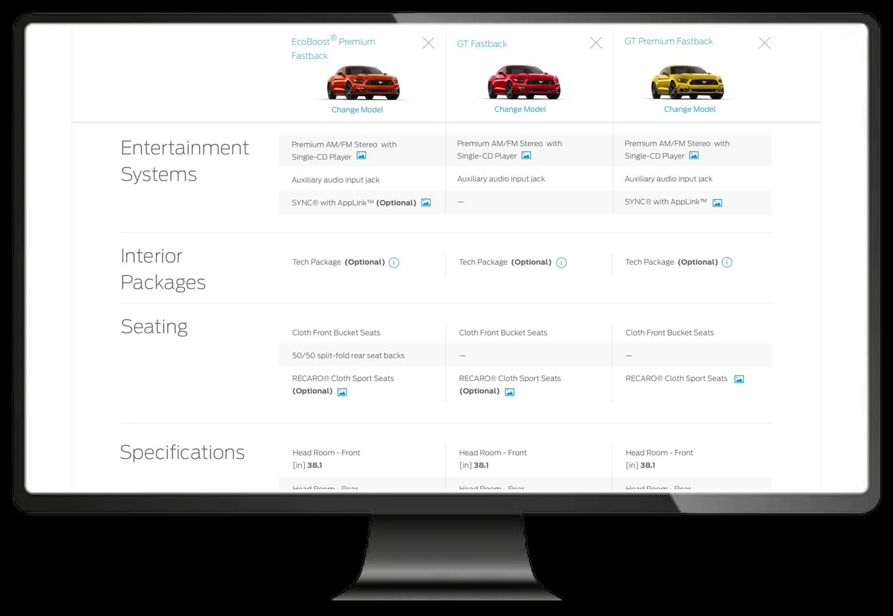
Information Overload: Users faced overwhelming option lists without clear guidance on compatibility or personalization, resulting in decision paralysis. For instance, selecting an engine might invalidate prior choices without intuitive feedback.
Lack of Engagement: Static 2D images and minimal interactivity failed to evoke excitement, contributing to low conversion rates (only 12% of sessions generated dealer leads).
Business Context: Amid Ford's shift toward customer-centric design — leadership emphasized UX principles over traditional benchmarking—the tool needed to support the company's "Ford+" mobility vision, blending e-commerce with seamless dealer integration.
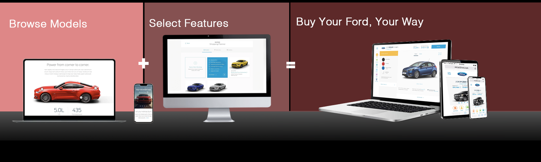
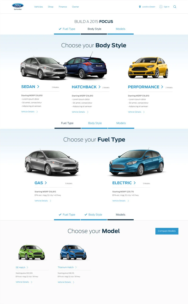
We began by enabling customers to easily identify the model that best fits their needs—creating a customer-centric experience focused on relevance and engagement throughout the vehicle-buying journey. Designed for global use, our approach required a deep understanding of regional nuances and the flexibility to adapt designs for diverse markets.
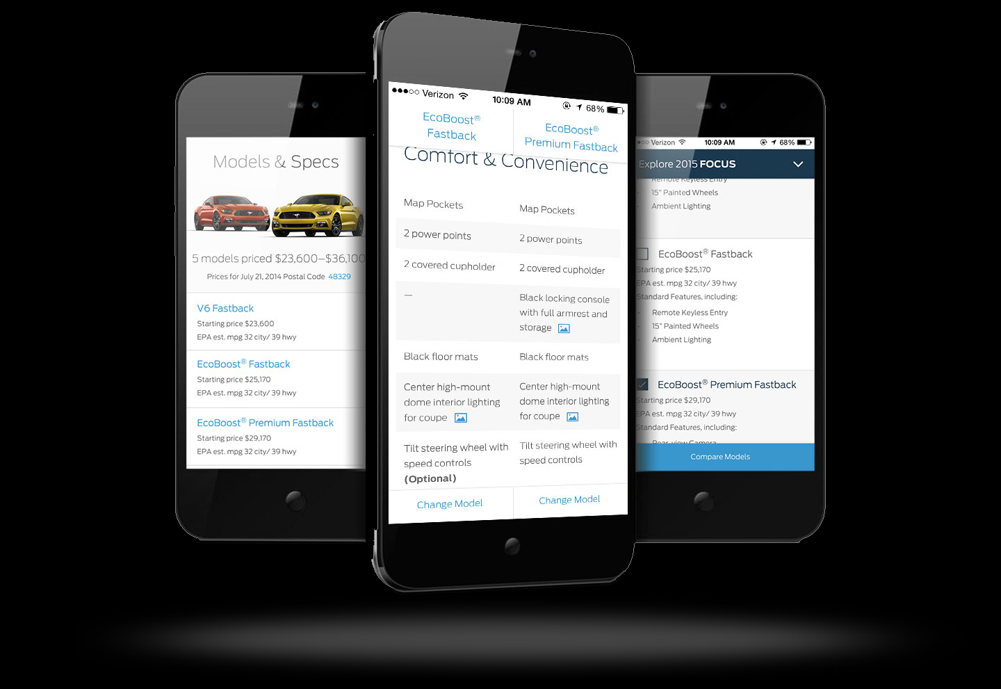
Browse Models
Research and Discovery
To ground our redesign in user needs, we employed a mixed-methods approach:
User Interviews and Surveys: Conducted 40 semi-structured interviews with recent Ford buyers (demographics: 25–55 years old, urban/suburban mix) and a survey of 1,200 Ford.com visitors. Key insights: 68% wanted faster customization, 55% sought visual previews, and 42% abandoned due to confusing pricing breakdowns.
Usability Testing: Ran 20 moderated sessions on the legacy tool using tools like UserTesting.com, identifying friction in option selection (e.g., hidden fees) and mobile scrolling issues. Heatmaps from Hotjar showed users fixating on price but ignoring educational tooltips.
Analytics Review: Dove into Google Analytics data, revealing 35% bounce rates on the first configuration page and peak drop-offs at the financing step.
Competitive Benchmarking: Analyzed 5 rivals (e.g., Chevrolet, Toyota)
Stakeholder Workshops: Facilitated 3 sessions with Ford's sales team to map dealer handoffs, ensuring UX supported offline conversions.
These efforts uncovered three personas: "The Researcher" (info-heavy, price-sensitive), "The Enthusiast" (visual, feature-focused), and "The Busy Buyer" (mobile, quick-decision).
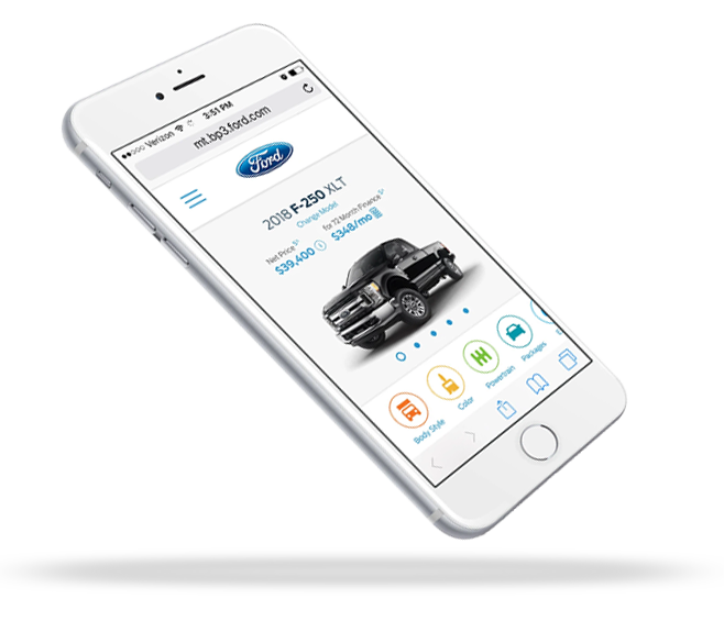
Build & Price

Design Process
Our iterative process followed Design Thinking principles, emphasizing empathy, ideation, prototyping, and testing.
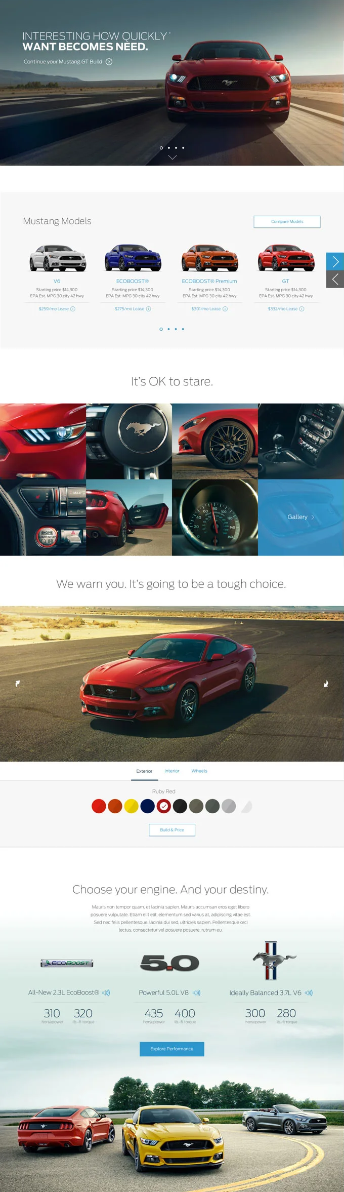
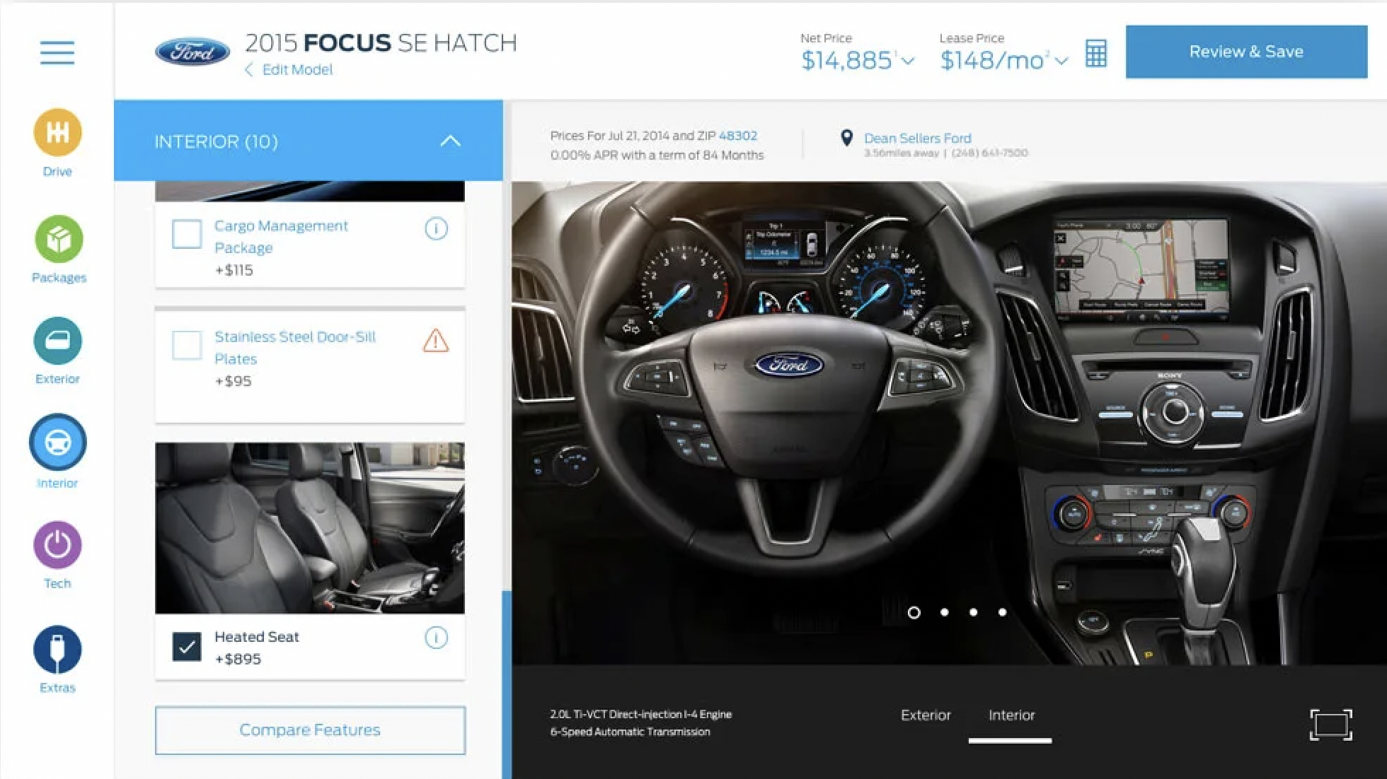
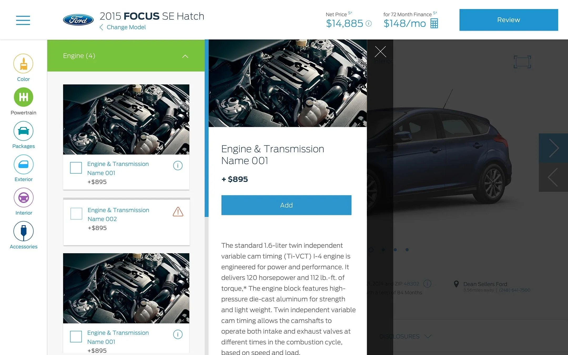
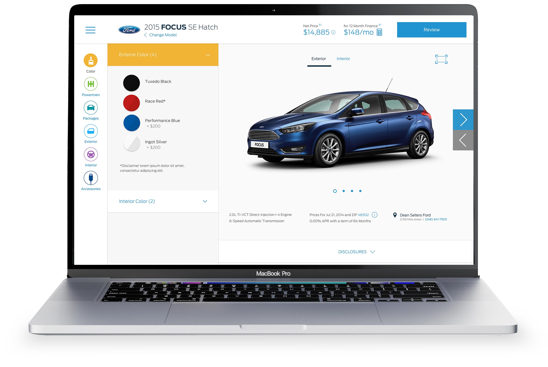
Ideation and Wireframing: Brainstormed 50+ concepts in Miro workshops, prioritizing a linear yet flexible flow: Model Selection → Trim & Powertrain → Exterior/Interior → Accessories → Summary & Price. Low-fidelity wireframes in Sketch emphasized progressive disclosure (e.g., collapsible option panels).
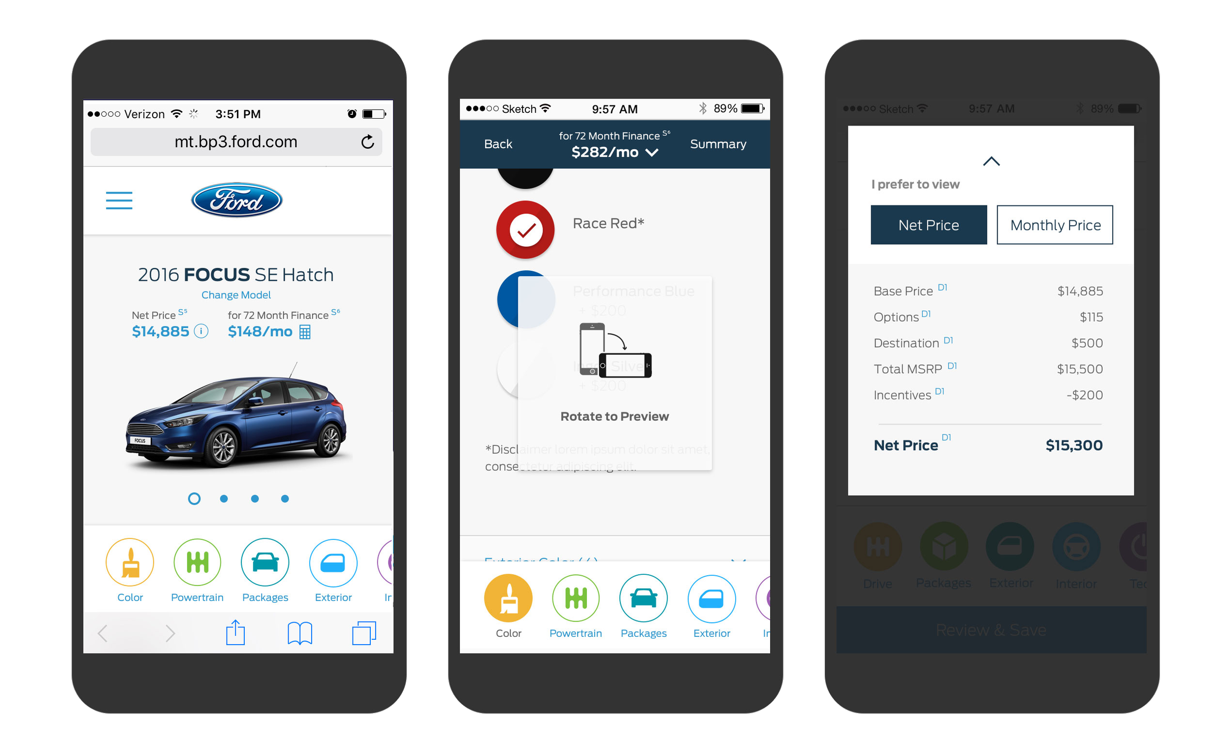
Prototyping: Built mid-fidelity prototypes in InVision, introducing interactive elements like drag-and-drop color swatches and real-time pricing sliders. High-fidelity mocks incorporated Ford's brand palette (e.g., blue accents for CTAs).
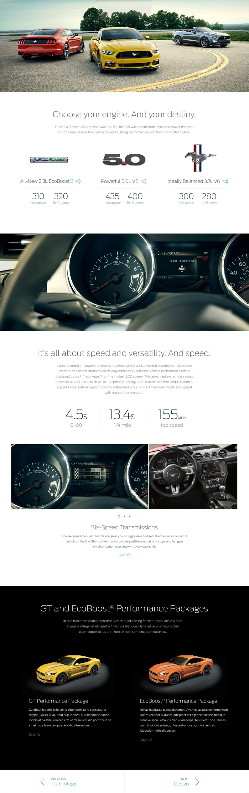
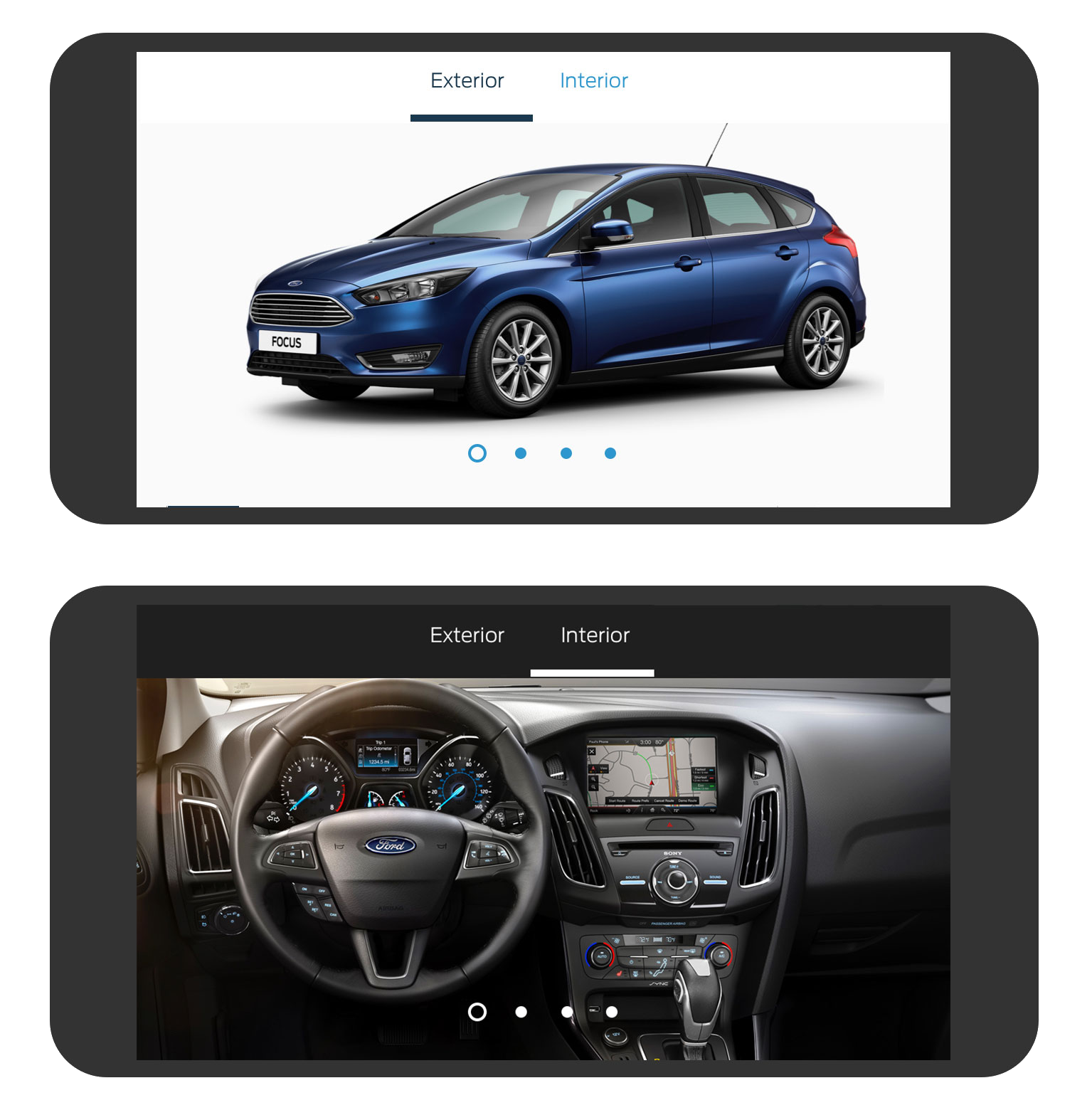
Visual Enhancements: Integrated 3D vehicle rendering via a third-party API, allowing 360° spins and zoomable details— a first for Ford.com. Added micro-animations for option changes (e.g., wheel swaps) to boost delight.
Accessibility and Inclusivity: Ensured ARIA labels for screen readers, high-contrast modes, and multilingual support (English/Spanish initially).
Mobile-First Approach: Responsive design with touch-friendly controls, reducing steps from 12 to 7 on phones.
We ran 4 sprint cycles, each ending in feedback loops with 10–15 users.
Results and Impact
Post-launch metrics (3 months post-rollout) validated the redesign:
Quantitative: Session abandonment dropped 45% (from 60% to 33%). Mobile traffic conversions improved 35%.
Qualitative: Net Promoter Score (NPS) for the tool jumped from 42 to 68, with user feedback praising "fun and easy" interactions.
Key Learnings and Reflections
This project reinforced the power of user-centered design in high-stakes e-commerce. Balancing business metrics (e.g., lead gen) with emotional engagement was key— the 3D visualizer wasn't just "nice-to-have" but a conversion driver. Challenges like stakeholder buy-in on mobile priorities were overcome through data storytelling. Looking back, I'd advocate earlier for voice-assisted customization, foreshadowing Ford's Sync 3 evolutions. Ultimately, this redesign positioned Ford.com as a leader in automotive UX, proving that intuitive digital tools can accelerate real-world purchases.
My Work
Motorola Solutions, AI Powered Physical & Digital SOC
Ford Motor Company, Global User Profile
Motorola Solutions, Advanced System Health
Chevrolet Corvette, The driver-centric cockpit experience
Ford Motor Company, Build & Price
Ford Pro Telematics, Enterprise Redesign at Scale
Ford GT, Back at Le Mans After 50 Years - Reveal & Configurator
Motorola Solutions, AAA Design Systems