Ford Pro Fleet Management
Enterprise Redesign at Scale
Case Study
Overview
I led the experience strategy and redesign of Ford Pro Telematics, transforming a fragmented fleet management platform into a unified, insight-driven system. Serving fleets from 5 to 5,000+ vehicles, the platform helps commercial operators monitor vehicle health, driver behavior, location, and costs in real time. The core challenge was turning overwhelming data into clear, actionable intelligence so fleet managers could make fast, confident decisions and reduce downtime in high-pressure environments.
My Role
As Global Design Manager, I set the end-to-end UX vision and experience strategy across telematics, connected vehicle, and fleet workflows. I directed a global team of 40+ designers, researchers, and front-end developers while partnering closely with Product, Engineering, and Marketing leadership.
Key contributions included:
Establishing a unified design system and interactive storybook with consistent patterns, accessibility, and scalability
Facilitating cross-functional workshops and prioritization frameworks to align teams
Coaching designers on systems thinking, data storytelling, craft excellence, and balancing quality with delivery speed
Driving design rituals (weekly critiques, reviews, and workshops) to raise the overall quality bar
Approach
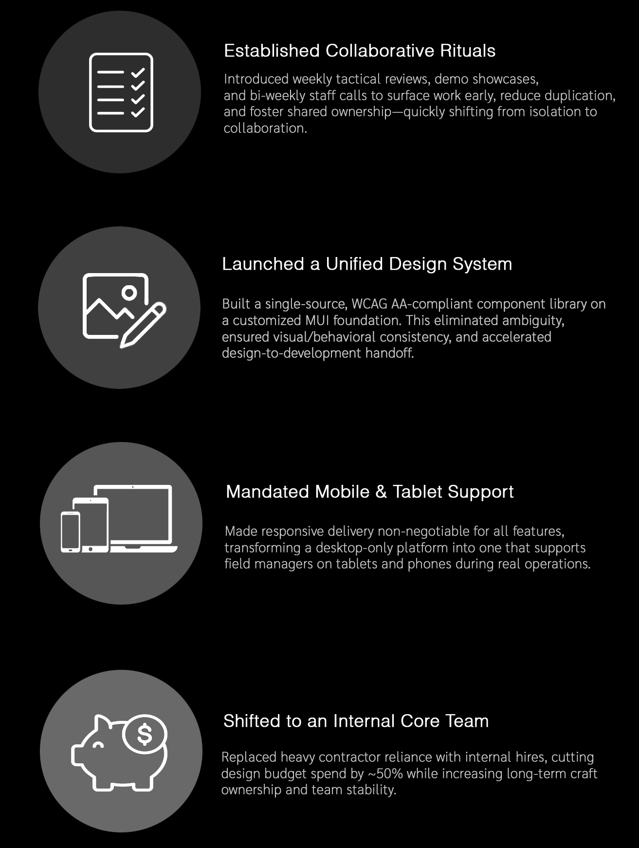
First 30 Day: Immediate Actions as Global Design Manager
I joined a capable but fragmented design organization spread across 10 agile teams. Designers worked in silos, leading to redundant components, inconsistent patterns, unowned shared experiences (e.g., settings), and disjointed user experiences that frustrated managers from cross functional teams and slowed velocity.
While still getting up to speed on the product, I was fortunate to contribute to four meaningful improvements
The Product Challenge
Fleet managers were drowning in data.
The existing Ford Pro Telematics platform delivered massive amounts of vehicle, driver, and location information, but it was fragmented, overwhelming, and hard to act on. Managers juggling fleets of 5 to 5,000+ vehicles faced scattered dashboards, buried insights, inconsistent workflows, and slow decision-making — leading to delayed maintenance, higher downtime, and increased operational costs.
In high-pressure commercial environments, users needed clarity at scale: the ability to quickly identify critical issues, prioritize actions, and collaborate effectively across teams — without cognitive overload or constant context switching.
The core challenge was transforming this data-heavy, reactive system into a unified, intelligent experience that delivered clear, actionable insights exactly when and where they were needed.

Research & Insights
I worked with the team to expand our research focus - looking at the broader Ford Pro experience while also diving deep into individual features.
Key learnings from market research
Fleet managers - ranging from small business owners to national logistics leaders—needed clearer, faster ways to answer mission-critical questions:
Are my vehicles healthy and available today?
Which drivers need attention?
What requires action right now?
What’s costing us the most time or money?
What Functions Does the Fleet Manager Want / JTDB by personas?
Monitor Fleet Status: See vehicle health, track driver behavior, view compliance status, monitor fuel usage and performance
Identify & Prioritize Risk: Detect safety issues, flag maintenance need, surface compliance violation and rank urgency
Make Informed Decisions: Understand impact of actions, compare performance data, see trends and anomalies and receive recommendations
Coordinate & Act: Assign task, communicate with drivers, schedule maintenance and adjust routes
Track & Optimize Performance: Reduce cost, improve safety metrics and plan strategically
The existing interface suffered from:
Disconnected workflows across health, diagnostics, location, and driver behavior. Fragmented and overwhelming data/insights
Limited visibility into non-vehicle assets and full operations
Driver behavior and safety monitoring gaps
EV transition and charging management difficulties - challenges included lack of real-time charge status/range insights, off-peak scheduling for cost/energy optimization etc.
Overwhelming data tables with no hierarchy or prioritization
Alerts and insights buried across pages, without appropriate and intuitive filters
A lack of mobile-friendly patterns for field technicians
Long onboarding curves for new fleet managers
We needed to transform the platform into a unified, insight-led system that could scale with Ford’s growing commercial ecosystem.
Competitive Analysis
(Click to enlarge)
User Journey Map
(Click to enlarge)
Prominent Use Cases for Fleets
Utilities (repair & service trucks)
Construction (mixed-vehicle fleets)
Government (city maintenance, police service fleets)
Delivery (last-mile delivery, high-volume parcel and e-commerce)

Key Insights

1. Fleet managers were drowning in data, not insight. They needed prioritization - not endless diagnostic tables.

2. Mobile was essential but not served. Field managers needed quick, actionable views—not full desktop interfaces.

3. Daily workflows were fragmented across tools. Vehicle status, driver behavior, maintenance planning, and routing didn’t talk to each other because teams worked in silos.

4. Fleet teams operated with “mental checklists.” We needed to embed these mental models into the product interface. These insights shaped our design principles.

5. Decisions required context, not just alerts. An alert without severity, cost impact, or recommended action was ignored.
Design Principles We Defined
Insight → Action
Lead with the “why” then humanize “what to do next”Clarity at Scale
Organize high-density data through hierarchy, grouping, in graphs with the principle “don’t make me think”Mobile First for Field Operations
Prioritize brevity, touch patterns, and contextual entry points.System Thinking & Design System
Ensure consistency across Ford Pro apps through shared components and patterns. Multiple teams behind the scenes, one unified experience.Adapt to Fleet Complexity
From 5 vehicles to 5,000 vehicles—same clarity, different scale.

Solution
I led the redesign of Ford Pro Telematics into a unified, insight-driven platform that transforms overwhelming fleet data into clear, prioritized, and actionable intelligence.
Key elements of the solution included:
A streamlined dashboard and workflow system with strong visual hierarchy, scannable data views, and contextual recommendations to reduce cognitive load
Consistent, scalable design patterns and an updated design system that improved usability across web and mobile for fleets of all sizes
Intelligent information architecture that surfaces critical insights first while enabling deeper investigation when needed
Tighter integration between monitoring, alerts, and action workflows to support faster decision-making under pressure
The new experience shifted the platform from reactive data overload to proactive, confidence-building operations — helping fleet managers quickly identify issues, prioritize actions, and minimize downtime.
A.Turn Data Tables into Clear, Human-Friendly Content
Charge Insights, part of E-Telematics
Designed to address a gaps in user experience for charge events on the Insights screen. At the time, we were unable to enter sufficiently detailed information, which limited visibility for site managers. Software platform, Tableau, did not support displaying the level of detail that site managers required to effectively monitor and analyze fleet performance. This solution was designed to enhance data capture and improve the accessibility and usefulness of charge event insights. Real-time charge/range status with
Charging Visualization: View aggregated data on where and when vehicles are charging (e.g., depot vs. public charging).
Energy & Cost Optimization: Access insights into kWhk consumption, charge speeds, and, crucially, data to avoid high-rate peak hours.
Detailed Analytics: Generate reports on charger health, energy usage, and potential misuse of public charging for non-fleet vehicles.
Battery Range Monitoring: Real-time monitoring of EV battery levels to ensure uptime and operational readiness.
Centralized Reporting: Exportable data to spreadsheets for in-depth analysis of fleet performance.
Charge Insights Dashboard
(Click to enlarge)
Reimbursement Reporting
(Click to enlarge)
Check Reporting on Cost vs Energy
(Click to enlarge)
Print Driver Reimbursement Statement
(Click to enlarge)
Driver Reimbursement Rate
(Click to enlarge)
Driver Filter
(Click to enlarge)
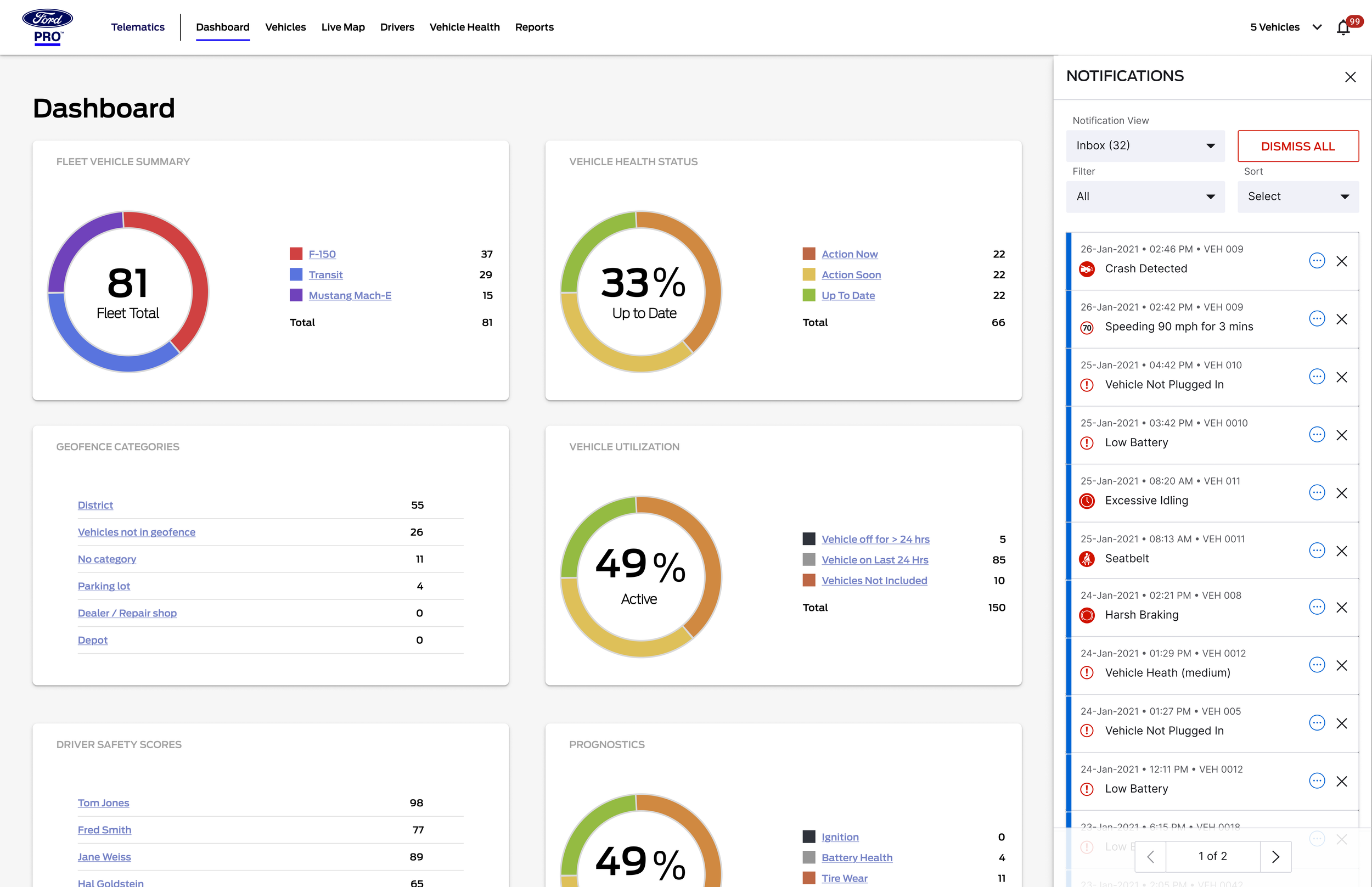
B. Unified Alerts Experience
Redesigned the notification management experience for fleet managers to handle growing complexity and scale. Delivered a redesigned Notifications Drawer that supports increasing notification types and fleet sizes. Enabled fleet managers to quickly find and act on critical notifications through new filter, pagination, and dismissal features. Introduced localization-friendly components, improving the global experience.
Built a cross-platform alerting framework with:
Normalized severity levels
Clear recommended actions
Support for mobile push + in-platform notifications
Transparent rules for when alerts trigger
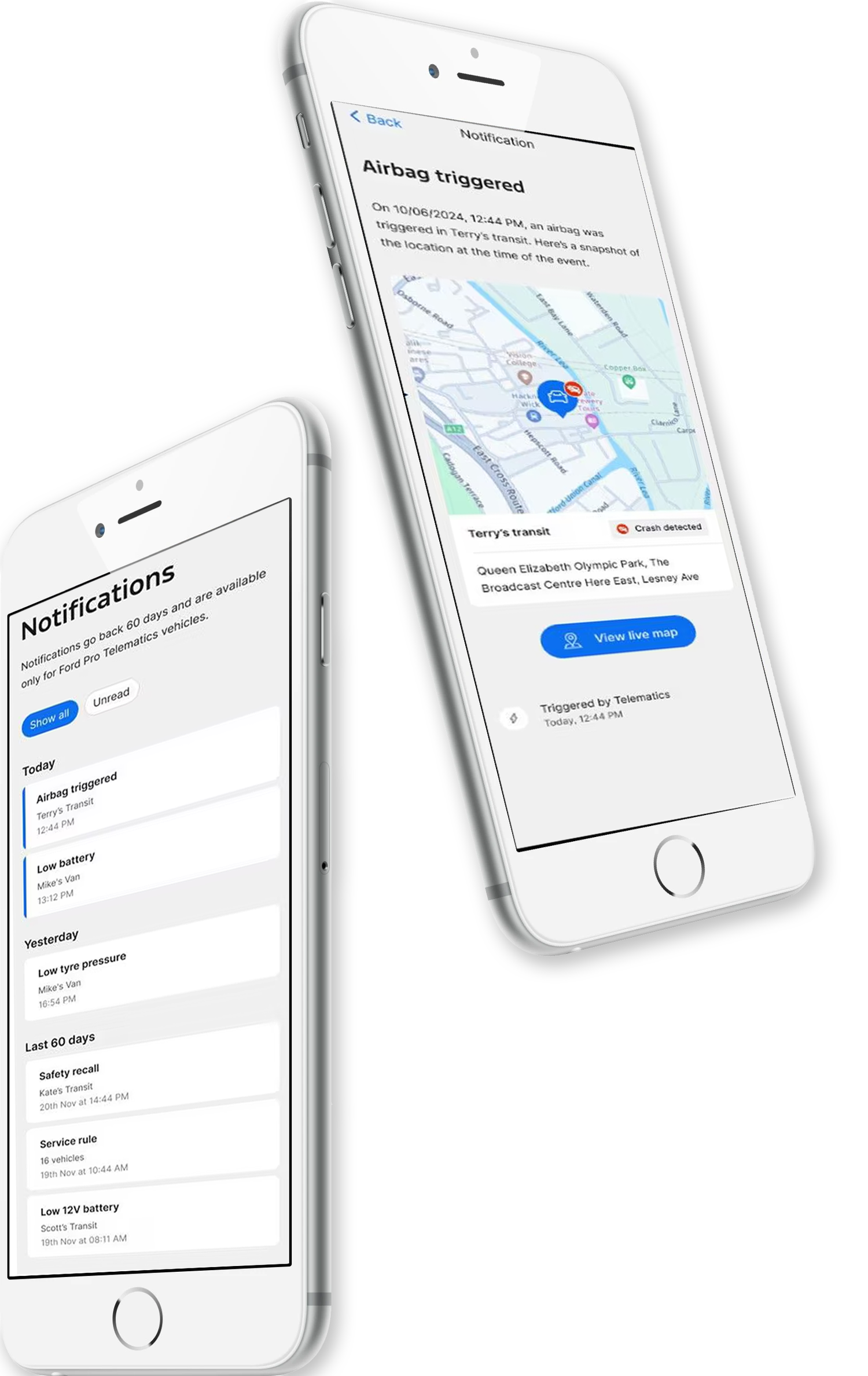
Tool Tips
Mobile Notifications
Desktop Notifications
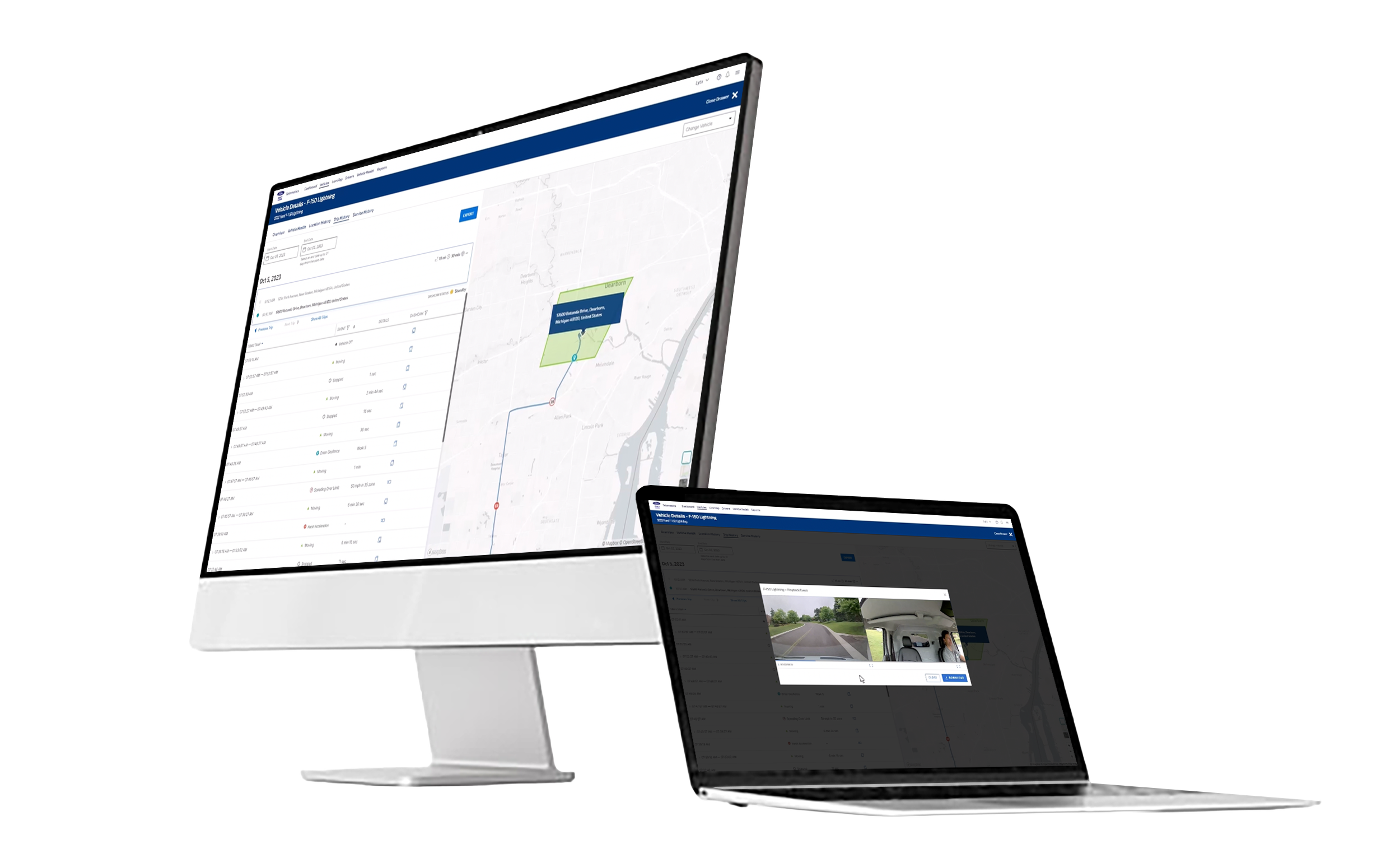
C. Live Map + Operational Layer
Map-based command center with:
Live vehicle locations: Customizable views (default, satellite, terrain) with live traffic overlays
Filters by assignment, status, or vehicle type: Intelligent clustering for crowded areas, better handling of overlapping pins, tooltips/labels for clarity.
Alerts layered onto the map (breakdowns, diagnostics, late routes): The initial dashboard provided basic metrics like speeding, harsh braking, acceleration, idling, and seatbelt usage trends, but lacked the deeper analytics, AI-powered event detection, or contextual breakdowns (e.g., distinguishing harsh braking due to road hazards vs. risky behavior) that arrived in subsequent updates.
One-tap access to driver or vehicle profiles
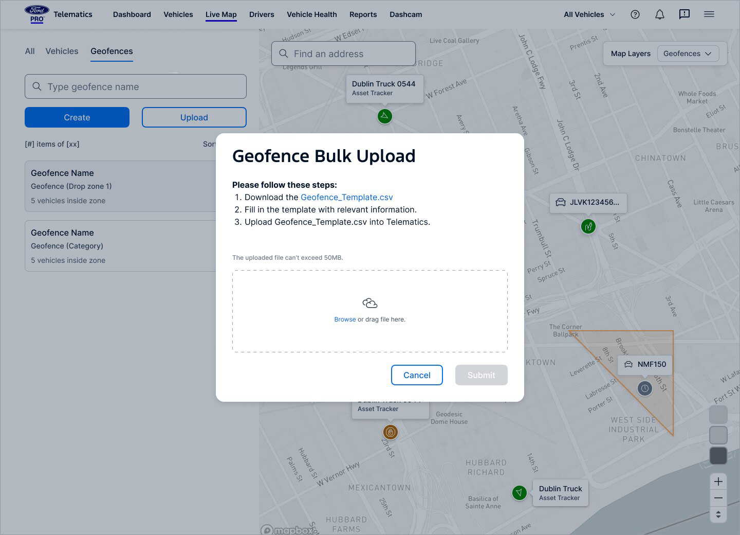
Geofencing (advanced bulk import/multi-group)
Mobile-first enhancements: Quick actions (Call driver, Navigate, Assign task)
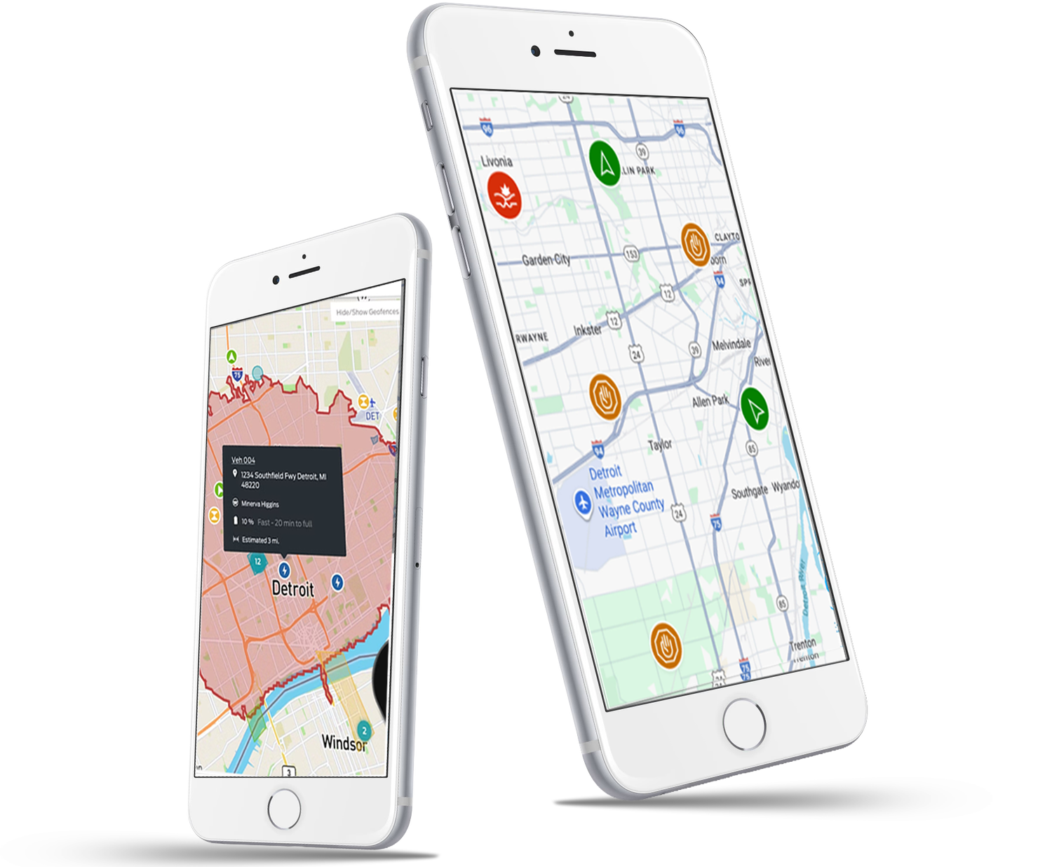
Geofence on map
Live monitoring
D. Driver Behavior & Safety Dashboard
Surface-level patterns highlighting:
Harsh braking
Idling patterns
GPS-based route events
Speeding risk zones
In-vehicle coaching (customizable alerts for speeding, idling, seatbelt, acceleration/braking)
Harsh event insights
Design decision: Pair quantitative data with contextual explanations to help managers coach drivers—not punish
Create Geofence
Dashcam
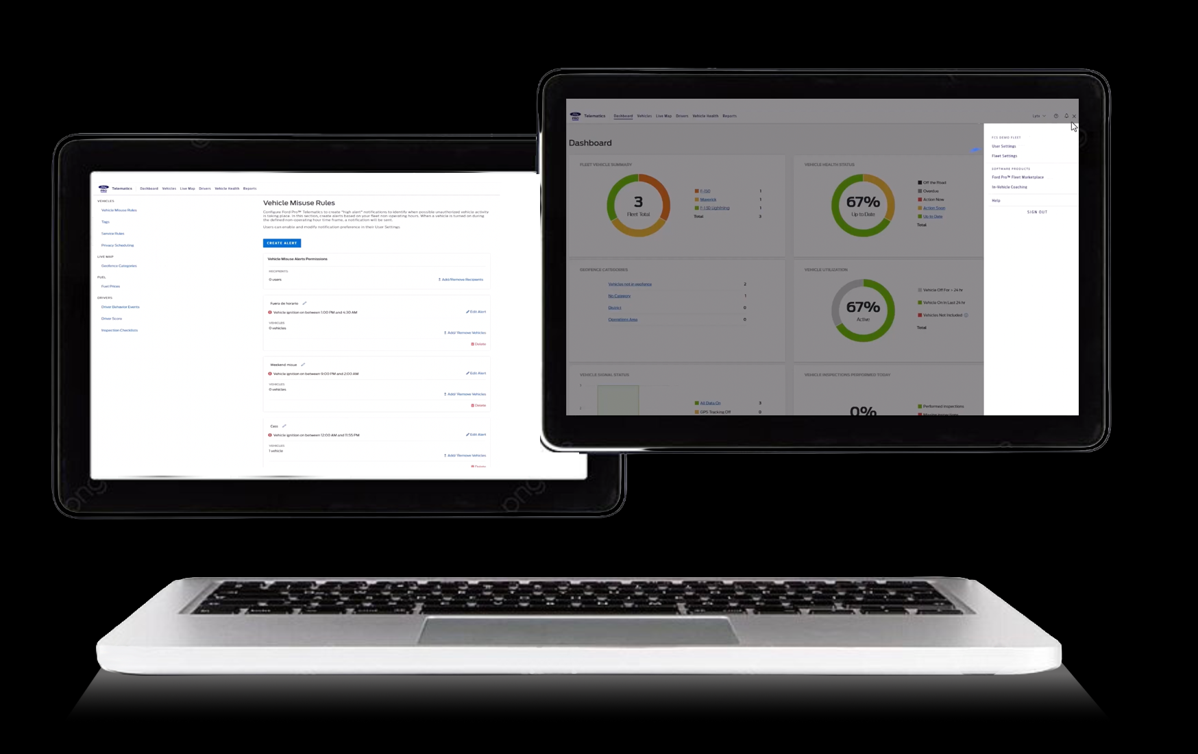
Settings
Fleet Settings
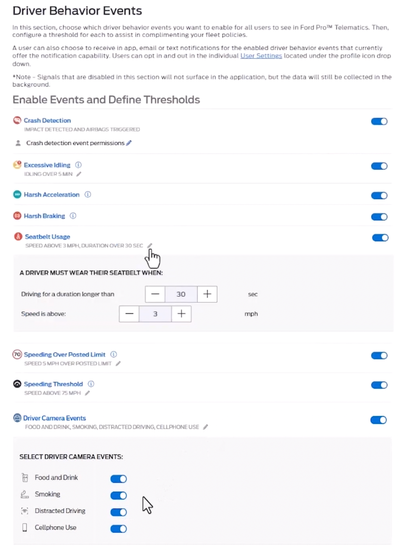
Driver Behavior Settings
Driver Behavior Details
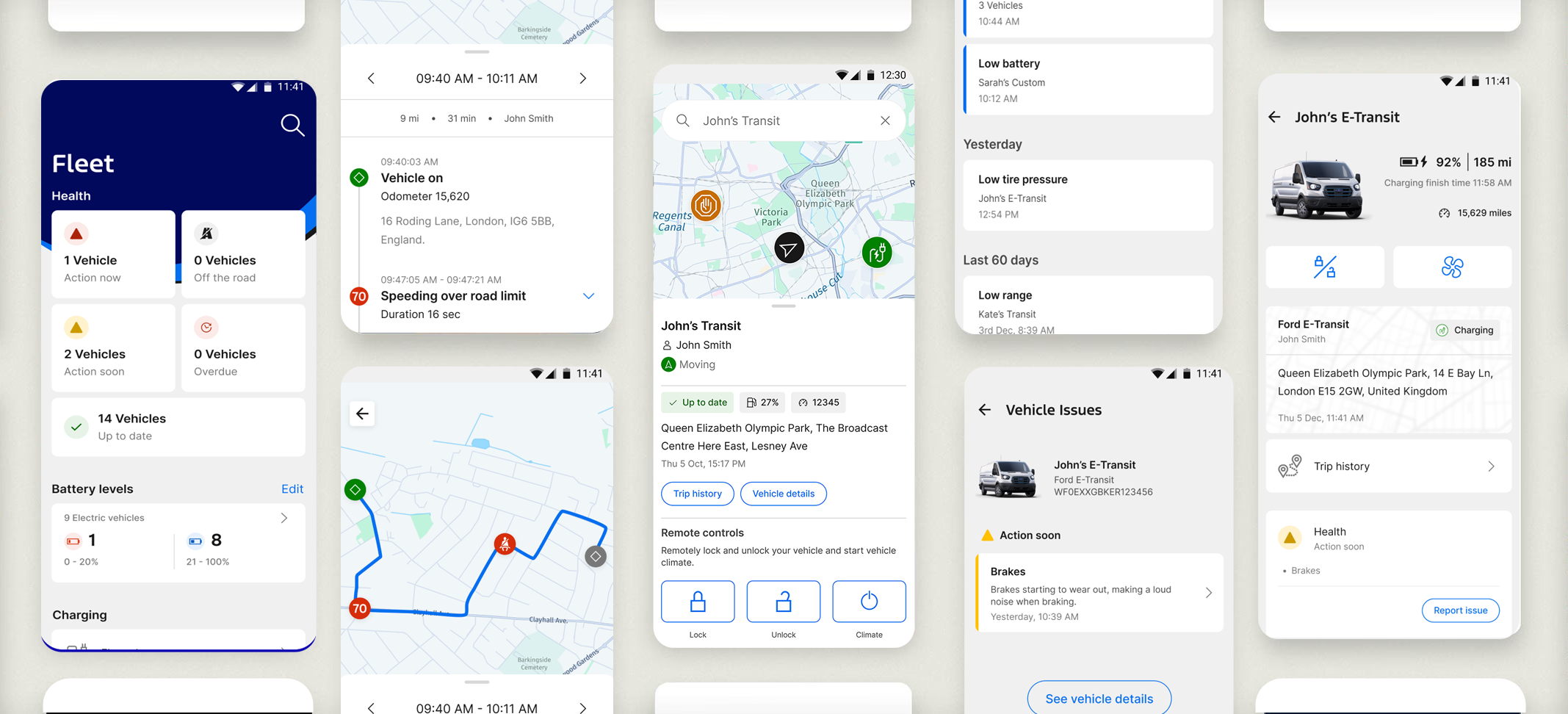
E. Vehicle Health Hub
A consolidated view of:
Issues by severity (Critical, Major, Minor)
Vehicle availability
Maintenance forecasting/alerts, predictive scheduling, in-app service scheduling
Diagnostic trouble codes with plain-language descriptions
Impact: Managers immediately knew which vehicles could operate today, actions to be taken and what could wait.
Fleet health overview
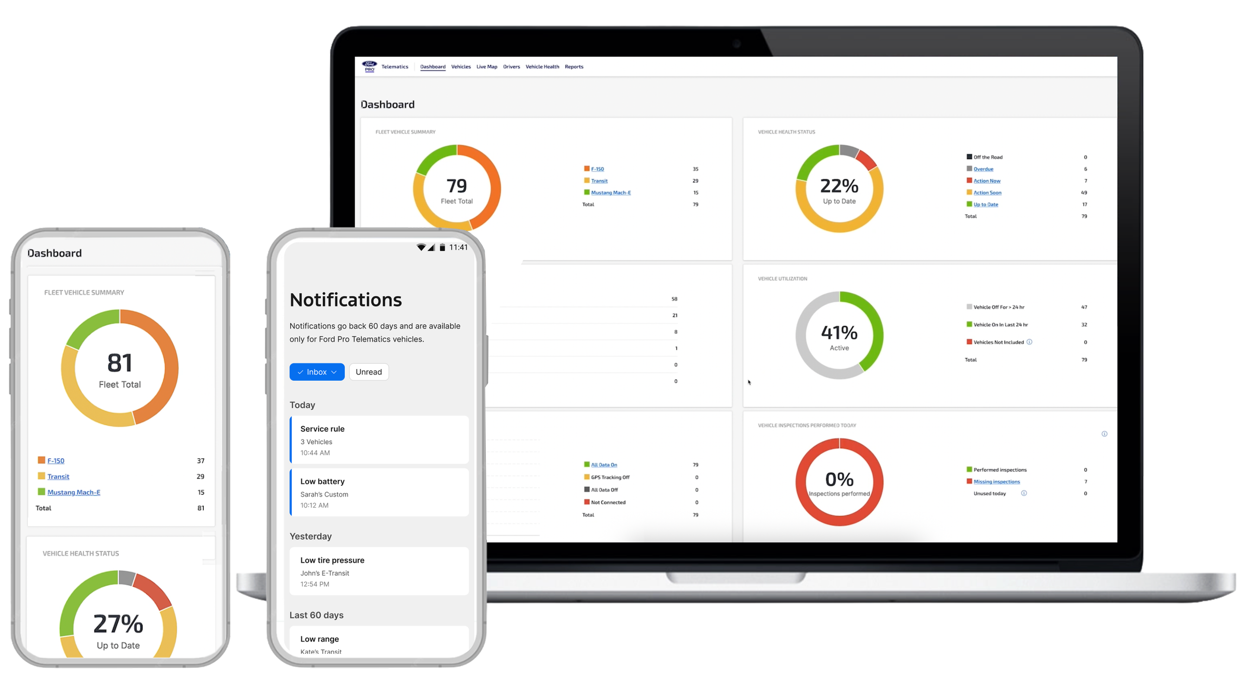
Dashboard
Get notifications about your fleet
F. Design System & Interaction Frameworks
Building a Unified Global Experience with Local Adaptability.
Collaborated across global regions, aligning workflows, tech, and business goals.
Led the team of front end developers to update previously created screens with new components and responsive design. Supported Mobile, Tablet and Desktop.
Established a unified interactive storybook to drive consistency across all markets.
Integrated accessibility, localization, and platform flexibility into every component.
Established processed and guidelines for product consistency across other Ford Pro applications.
G. Collaboration & Leadership
Cross-Functional Alignment
Created process to unify PM, Engineering, PO and Design teams around:
Workflow models
Prioritization frameworks
System architecture
Release-level UX requirements
Team Leadership
I mentored designers on:
Effective storytelling with data
High-fidelity prototyping
Designing for enterprise scalability
Balancing craft excellence with delivery pressure
Results & Outcomes
The redesign delivered measurable clarity and efficiency at enterprise scale:
Managers could diagnose issues in seconds instead of minutes
Significantly higher alert acknowledgment and action rates thanks to prioritized, contextual insights and recommended actions
Improved adoption of mobile workflows for field teams
Accelerated design and development velocity through stronger consistency and shared components
Shifted the product from reactive data overload to proactive, insight-led operations — reducing fleet downtime and operational costs
This work strengthened cross-functional alignment, built team confidence, and created a scalable foundation ready for future intelligent capabilities

Reflection
This project reinforced for me how critical clarity at scale is in enterprise platforms. When users operate under real business pressure with high financial and operational stakes, even small improvements in hierarchy, prioritization, and information scent can dramatically shift outcomes.
What stood out most was the power of cross-functional partnership. By aligning Design, Product, and Engineering early and often — through shared vision workshops and transparent trade-off discussions — we moved from fragmented data views to a cohesive system that felt proactive rather than reactive.
I also learned the importance of raising the craft bar consistently while maintaining velocity. Establishing a unified design system and stronger critique rituals not only improved usability and accessibility but also built team confidence and accelerated delivery.
Above all, the experience deepened my belief that great enterprise design isn’t about making complex things simple — it’s about making complex things understandable and actionable at the moment it matters most. This mindset directly informs how I approach platform experiences today, especially when designing for AI-enhanced workflows where intelligent capabilities must enhance clarity rather than add to the noise.

My Work
Motorola Solutions, AI Powered Physical & Digital SOC
Ford Motor Company, Global User Profile
Motorola Solutions, Advanced System Health
Chevrolet Corvette, The driver-centric cockpit experience
Ford Motor Company, Build & Price
Ford Pro Telematics, Enterprise Redesign at Scale
Ford GT, Back at Le Mans After 50 Years - Reveal & Configurator
Motorola Solutions, AAA Design Systems